[vc_row][vc_column][vc_column_text] [/vc_column_text][vc_column_text css=”.vc_custom_1532346473758{padding-top: 40px !important;}”]
CONTEMPORARY ELEGANCE IN A PREWAR APARTMENT
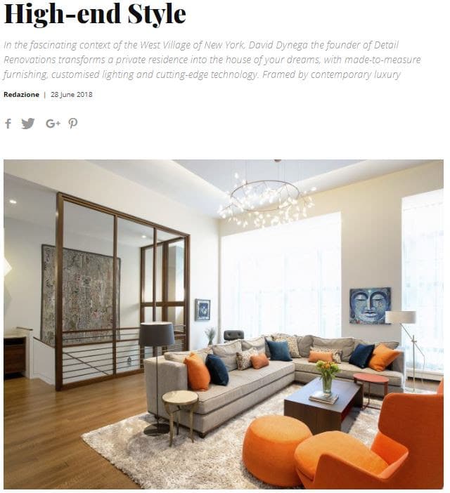
We renovated this Pre-war apartment on West End Avenue, to accommodate a large family, a lot of entertaining and a recording studio. We found unused space above the existing ceiling and managed to add 12 inches to the height of the apartment, making the total ceiling height 112 inches, creating a whole new look and feel.[/vc_column_text][/vc_column][/vc_row][vc_row css=”.vc_custom_1529678085787{padding-top: 40px !important;padding-bottom: 40px !important;}”][vc_column][vc_separator][/vc_column][/vc_row][vc_row][vc_column][vc_column_text css=”.vc_custom_1532346732940{padding-bottom: 40px !important;}”]
Unique Features of 270 West End Avenue
Floating Shelves:
To illuminate shelves with absolutely no glare, recess the lighting into the shelving. It creates the perfect backlighting.

Custom Millwork:
We did a lot of custom millwork throughout this apartment. As a unique treatment that makes the room look more spacious, we created floating countertops above all the cabinetry.

Luxury Flooring Refinishing:
All the Pre-war wood floors in the apartment were sanded and refinished in a rich, beautiful dark color. This helps to hide any imperfections and adds character to the entire apartment.
 [/vc_column_text][/vc_column][/vc_row][vc_row css=”.vc_custom_1529678070607{padding-top: 40px !important;padding-bottom: 40px !important;}”][vc_column][vc_separator][/vc_column][/vc_row][vc_row][vc_column][vc_column_text]
RECENT PRESS
Thank you Interior Furniture Design Magazine for the lovely feature, see more via this link:
http://ow.ly/z5UQ30kVqc0
 [/vc_column_text][/vc_column][/vc_row]

